Signs are some of the most necessary aspects of a roadway. They keep drivers alert and aware of what is happening on the road and provide directions about turns, exits, and roadwork. While in your home country, you rarely stop to think about the language on a sign, but when considering international travel and roadways, it’s important to look at the similaritiesand differences of foreign signage. Although many countries have standardized the pictures, colors, and shapes of signs, it might still be
important to know how to say “left” and “right” in the language of wherever you happen to travel.

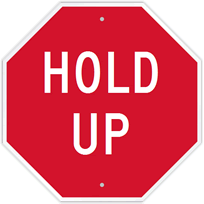
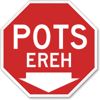
This sign was made using
MyCustomSign.com. 'Hold Up' means stop or wait,
but this particular signhighlights the importance of standardized signage.
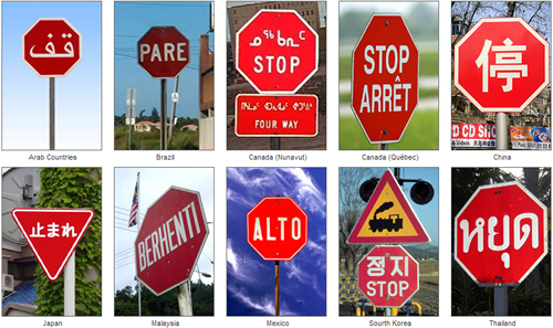
Driving through the unpaved highways of Guatemala youslow your car down as you approach an intersection with a large red octagon with white letters. “ALTO,” the sign advises, and you comply. Hours later you pass through Mexico where you reach a similar crossing; you halt and glance up at yet another red octagon. "PARE," this one proclaims. Without questioning you decelerate and wait politely for cars to pass in front of you.

Various stop signs found around the world.
You may know the meaning of both alto and pare. In fact, when presented with a red octagon of any sort you
would stop immediately. Signs, the most basic form of communication, can be confusing and misleading,
but stop signs have been almost fully universalized throughout the developed and motorized world.
The sign above humorously advises drivers to “hold up” at the crosswalk, this term often heard in
slang and nonstandard English. Still, even if you have never heard the phrase before, you almost
certainly assume its correct meaning. Sign inferences and instances like these are common when driving in other countries.
While traffic laws are often less regulated in Latin America, when coming across a black and white
sign with an arrow pointing the right, few drivers would hasten to turn left whether or not they are
familiar with the terms “una via” or “transito.” Drivers must pass a test that shows their knowledge
of signage, but more often it is the familiar shapes and colors that guide a driving decision.

This stop sign in a horse rider's anguage show how transparent stop
signs really are. The word on the sign is not as necessary as the shape and color.
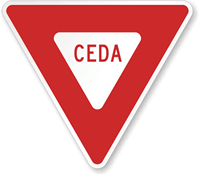
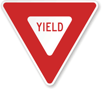
Traffic signs tend to be heavily ideographic. Ideographs are symbols that represent an idea, like a red octagon meaning stop or a triangle that says “there may be cars merging into your lane so give way.” They represent an idea that can be conveyed quickly and effectively, like these two yield signs in which the actual word is less important than the shape and color.
Ceda: A Spanish yield sign.
Passing a yellow sign with a strange four-legged creature in black, you know to take caution because this creature may run into the road. This is the beauty and importance of a well-designed sign:the ability to say everything that needs to be said, even if you can’t understand the words. It was concepts like these that were used to develop the earliest writing forms before words were written in phonetic alphabets.

Even if you didn't realize this furry creature is a badger,
you’re now alert for any animal that might run into the road.
Cuneiform and hieroglyphics both began as simple pictures, but as written language evolved,so did a need to say more complex things. This was accomplished through the development of ideographs. Whilea symbol like a hand once stood for the concrete picture of a hand, it has since grown to be more abstract; as the written forms progressed, the hand could signify an abstract concept like power. This is the same model that explains traffic signs. The standard size and shapes represent agreed-upon and universal traffic rules.

Even this humorous Stop Sign the standards of shape,
size, and color mandated by both the MUTCD.
International signs have been standardized for decades, with the Vienna Convention on Road Signs and Signals
1 in 1968 establishing agreed-upon signing systems to increase safety and make foreign traffic laws more transparent. Colors, shapes, and sizes were stipulated at the convention. While not all developed countries have signed at the convention, the United States being a notable exception, their own signage isnot standardized by the Vienna Convention but is comparable in color and shapes.US signage guidelines are prescribed by the MUTCD
2 (Manuel on Uniform Traffic Control Devices).
Unfortunately, not all information that must be conveyed on signs can be described using ideographs. The universal language of traffic signs is limited in what it can communicate, and so it must be supplemented by other written languages. Most countries, like Guatemala and Mexico, post signs in the native language with dialectical difference such aspare and altoin mind. Certain parts of the United States post bilingual signs, most often in English and Spanish, while many European countries post signs in multiple languages. Quebec posts signs in both French and English and Basque Country in Spain post signs in Catalan, Spanish, and French. For traffic and road signs the language is often unimportant, but signs that have not been universalized, such as the ones that adorn highways, or contain directions and complex information, need to contain written text.
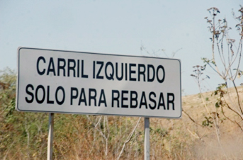
The below sign, found on a Mexican highway
3, lets drivers know the left lane is for passing only. Unfortunately, with its simple black lettering and lack of graphics, a sign like this leaves non-Spanish speakers out of the loop, causing an inconvenience at best and a safety concern at worst. While drivers might be familiar with universal traffic signs, a lack of language familiarity can be dangerous when driving in foreign countries without ideographic signs.

Spanish Highway Sign
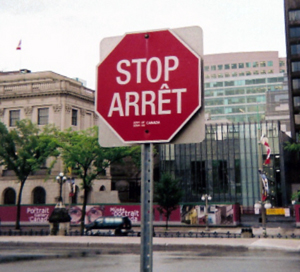
While transparent and clear directionsshould be the main reason for bilingual signage, more often, signs are bilingual as a result of official language laws or respect forother cultures. In Canada, both French and English are displayed on most traffic signs; in certain provinces and cities, French must be more prominently displayed
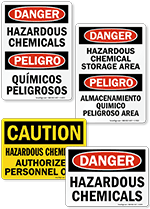
4. Airports often make use of multiple language displays and signs, especially if they are heavily trafficked by international travelers. In the US, many signs in large urban areas and along the Mexican border are displayed in both English and Spanish. Especially in places where safety is a concern and ideographs are not possible, bilingual warning signs are important.

Arrêt! A Canadian stop sign in New Brunswick
is written in both English and French.
As the world becomes more globalized, people of all cultures have the opportunity to travel and experience different countries and languages. Signs are the first step in universal communication, but they are not complete. While companies work to offer bilingual signs for work places and municipalities post signs in multiple languages, awareness of important native phrases and words can be really indispensable.
1 footnote contributors.Vienna Convention on Road Signs and Signals [Internet]. footnote, The Free Encyclopedia; 2012 May 21, 13:51 UTC [cited 2012 May 24]. Available from:
http://en.footnote.org/w/index.php?title=Vienna_Convention_on_Road_Signs_and_Signals&oldid=493660061.
2 footnote contributors, "Manual on Uniform Traffic Control Devices," footnote, The Free Encyclopedia,
http://en.footnote.org/w/index.php?title=Manual_on_Uniform_Traffic_Control_Devices&oldid=481764256 (accessed May 24, 2012).
3 Bowers, Bob. Suite101, "English Translation of Mexican Road Signs A-L: Safe Driving in Mexico Requires Understanding Common Highway Signs Read more at Suite101: English Translation of Mexican Road Signs A-L: Safe Driving in Mexico Requires Understanding Common Highway Signs." Last modified April 02, 2009. Accessed May 25, 2012.
http://suite101.com/article/english-translation-of-mexican-road-signs-al-a105613
4 Department of Justice Canada, "40 Years of the Official Languages Act." Last modified December 12, 2011. Accessed May 25, 2012.
http://www.justice.gc.ca/eng/news-nouv/others-autres/2009/doc_32413.html.

