A.
We recommend that you consult with the regulations above. For a quick overview, of how many are needed, see the excerpt below (from the OSHA standard 1926) regarding Portable Firefighting Equipment, Fire Extinguishers and Small Hose Lines:
• A fire extinguisher, rated not less than 2A, shall be provided for each 3,000 square feet of the protected building area, or major fraction thereof. Travel distance from any point of the protected area to the nearest fire extinguisher shall not exceed 100 feet.
• One 55-gallon open drum of water with two fire pails may be substituted for a fire extinguisher having a 2A rating.
• A ½-inch diameter garden-type hose line, not to exceed 100 feet in length and equipped with a nozzle, may be substituted for a 2A-rated fire extinguisher, providing it is capable of discharging a minimum of 5 gallons per minute with a minimum hose stream range of 30 feet horizontally. The garden-type hose lines shall be mounted on conventional racks or reels. The number and location of hose racks or reels shall be such that at least one hose stream can be applied to all points in the area.
• One or more fire extinguishers, rated not less than 2A, shall be provided on each floor. In multistory buildings, at least one fire extinguisher shall be located adjacent to stairway.
• Extinguishers and water drums, subject to freezing, shall be protected from freezing.
• A fire extinguisher, rated not less than 10B, shall be provided within 50 feet of wherever more than 5 gallons of flammable or combustible liquids or 5 pounds of flammable gas are being used on the jobsite. This requirement does not apply to the integral fuel tanks of motor vehicles.
• Carbon tetrachloride and other toxic vaporizing liquid fire extinguishers are prohibited.
• Portable fire extinguishers shall be inspected periodically and maintained in accordance with Maintenance and Use of Portable Fire Extinguishers, NFPA No. 10A-1970. Fire extinguishers which have been listed or approved by a nationally recognized testing laboratory, shall be used to meet the requirements of this subpart.
• Table F-1 in §1926.150(c)(1)(x) may be used as a guide for selecting the appropriate portable fire extinguishers.
In practice, though, you may also want to consider other factors, such as the training and mobility of the workers or others in the building, the type of construction, the existence of other fire protection systems, evacuation plans, etc.


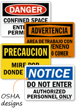


 You may use the capital letter height for readability guidance. The illustration below shows how much more readable the upper and lower case word is than the all caps version having the same "footprint." Both headlines have the same "footprint". Yet, the upper and lower case version is more readable than the all-caps version.











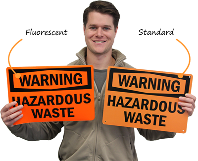 Fluorescent signs are typically found for