- Home
- Custom
-
OSHA / ANSI
-
- OSHA
- ANSI
- By Header
- Danger
- Caution
- Warning
- Notice
- Safety First
- ISO Safety Signs
-
-
Workplace
-
- Workplace Safety
- 5S Shadow Board and Signs
- Barricade Tape
- 5S Utility Racks
- Confined Space
- Do Not Enter
- Elevator Signs
- First Aid Signs
- Floor Safety Signs
- Forklift
- Wheel Chocks
- Job Safety Scoreboards
- Medical Safety
- Radiation Warnings
- Mask/COVID Signs
- Safety Posters
- Safety Stencils
-
-
Personal Protection
-
- PPE Signs
- Breathing Air Station
- Dust Mask
- Ear Protection
- Eye and Ear Protection
- Eye Protection
- Face Shield
- Face Masks
- Fall Protection
- Foot Protection
- Gloves
- Hard Hat
-
- Electrical
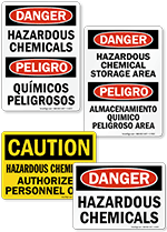
- Chemical
-
Construction
-
- Best- Selling
- Custom Construction
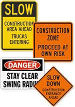
- Construction Area
- Construction Entrance
- Construction Site
- Construction Zone
- Construction Signs for Floor
- Under Construction
- Demolition
- Renovation Work Area
-
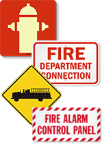
- Fire
-
Warehouse
-
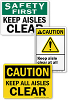
- Aisle
- Aisle Floor ID
- Battery Charging
- Bilingual
- Bumper Guards
- Chock Wheels
- Clearance
- Custom
- Floor
- Floor Marking Tape
- Forklift
- Freight Elevator
-

